Typical Day at Torquay Elementary School
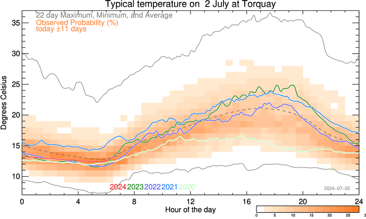
What does this figure show?
When people experience weather a common question seems to be, "Is this normal?" In order to help see what kind of temperatures are normal here in Victoria we have added some new plots to the site. The idea is to show the current conditions compared to what we have observed in the past at each site. Only data that we have collected on our network is shown here. In general the length of the record at a particular site is still quite short.
To make the plots we extract data from our database for the ten days before and after a particular day for every year of data in the record. We need to do this because in most cases we haven't observed enough instances of a particular day to know what normal is. For example, if we were plotting 5 June we would examine all of the data in the database from 26 May to 15 June from every year of data we have stored.
Once the data is retrieved from the database we determine the minute by minute extremes and average (excluding data from "today"). These values are plotted with solid and dashed grey lines. Next we compute the observed probability of seeing a temperature at a particular time of day. These values are shown shaded in the orange boxes. Each darker shade represents an increase of five percent in probability with white covering the zero to five percent range. Finally we overlay up to five of the most recently observed sets of data for this day and month. The most recent record is in bright red and will probably be incomplete (unless we don't have current data or it is close to midnight).
Our hope is that these plots will help you make sense of today's weather. We know that people tend to remember weather that affected them in some way and have a very biased view of what is normal as a result. Let us know if these plots are useful or confusing. Any comments at all are welcome.


